Let me start by saying I am not an automotive designer, I am just a product designer with maybe little understanding of aesthetics. Mahindra is one of the oldest manufacturers in India and is probably the leader when it comes to SUV, MPVs and other utility vehicles as well. Mahindra is a highly respectable organisation and has given a lot of people employment over decades.
In their passenger car business I like the Thar (jeep), Bolero and the Scorpio and to some extent maybe XUV 500 too but some how the design in their stable has been off. I know many designers will not speak a word in open, definitely not on forums but someone's got to say it. I will not talk about their roll and yaw quality, not really an expert on that, but will only share what I feel about Mahindra's design. I have held myself to write this article for a very long time, cos the design industry is small and my intention is really not to dis anyone.
Over the years Mahindra has created some great vehicles for users who are looking for big vehicles to show off on a budget. It's true that Mahindra does pack a vehicle with all the bells and whistles and probably is the most value for money solution in the market for SUVs. Hence the sales are way up, but lets take a look at their passenger car exterior design from a designer's perspective. It is indeed true that Mahindra has taken over Pininfarina and Ssang Yong and they are getting better at product design but they really need to define a strong language.
Its not just me well the best reviews from Autocar's Renuka and many other unbiased auto enthusiasts have clearly testified in their videos that when it comes to exterior design Mahindra's design studio is overdoing it.

One strong look at Mahindra's cars and one is wondering what is happening to their surfaces? they just seem so unresolved! Apart from the surfaces it is evident that they are struggling with their grill design which they evolved from Jeep (Mahindra used to manufacture jeep in India) more since Jeep decided to come back to India in 2016. The inconsistency is just unreal. I have used some older design images, because they are not really that old and I wanted to emphasize that maybe the designers at Mahindra too feel that things need to change.

The struggle for identity is real. the grill has been changing so frequently and drastically its not really great for the overall DNA.

My hunch is that most of the design decisions are marketing/sales driven, right from naming cars and engines from hawk, shark, cheetah, (god knows what's next in the zoo). Yes I know there is nature and form and bio-mimicry etc. but selling that as a story to the Indian customer is like saying, Indian's love stickers of Bittu, Bablu, Jaat Buoy etc. so lets give them factory set, our own stickers (Live young, live free). Or like saying "Indians like mehendi, so gaadi pe gota (decorative frills) lagate hain". Which Mahindra actually did in their older XUV design. The tail lamp had a tribal art/mehendi/decoration on it!! We don't see that from international manufacturers do we? Mahindra makes mistakes and then probably tries to correct them with uplifts. but who am I to say the sales are up!
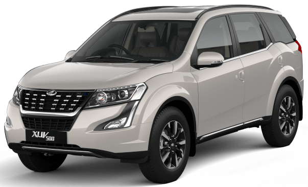
Speaking of the XUV 500 first (300 is on a borrowed platform so will omit), the changes are most welcome. I really love the proportions of XUV, but as one gets closer they are bombarded with all the cuts and curves that it almost looks like a leopard with spots (oops Cheetah!). We can clearly see that in the latest version, Mahindra has significantly mellowed the wild cat, more domesticated now!
Look closer you's see the decorative art work on the previous XUV 500 tail lamp
Thank fully they changed it. and the newer XUV 500 is with lesser cuts and noise on the front fascia as well. Great job!
It's not that I hate all of their cars, maybe when I look at Marazzo or Scorpio in Isolation I still might like them a little. But I am a strong believer of brand consistency being a major player for any design success.
Lets talk about the other three odd cars. TUV, KUV and E2O pulse.
TUV is one big box! that's it nothing to it. Am sure even the designers saw the first prototype and were like yes we created a box. Right from fog lamps, thin front grill, straight shoulder line, overhangs, everything is a box, and the negative C pillar is such a hindrance to the trained eye. The car would look more balanced with a backward falling C pillar, much the other cars of its class.

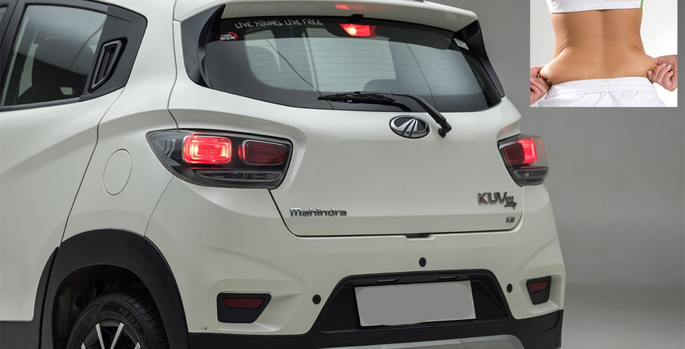
The KUV 100 unfortunately does not look less than a caricature. The proportions somehow just not please the eye. I will give it to Mahindra here for having taken permission/changed rules for the 3 seats in the front. Really thoughtful for lower middle class large families. Apart from that the design itself is just strange. The mascara on the headlamps, to the teeth like grill to the big love handles (feature lines) at the back everything scream over design. The feature lines are so deep and thick that it looks like excess fat! I know what flamed/tortured surfaces are and these are certainly not in rhythm. Good work on the tail lamps though.
E2O pulse is another disturbing vehicle. On one half of the world we have electric cars and concepts that are just drool worthy! And on the other to lower cost maybe we just compromise on the design. Apart from being funnily proportioned, many surfaces on E2O have been left unfinished. I can see the side feature also used on the Marrazo (a negative surface rendition) . I just hope we did not have any influences there.

Last word, I love Indian car manufacturers they have their own learning curves. and have huge potentials for our people tomorrow. While I admire what Tata's have done hiring Pratap Bose and opening up studios globally, I truly admire Mahindra for giving Indian designers a chance to do something. But looks like a lot of final design decisions are taken by marketing or management. However, great brands are consistent and the Indian consumer should not be taken for granted. Things like "whatever you make in India sells, price is king", etc. is okay but we need to be more design sensitized about our consumers especially if our brands want to go global in developed nations (North american, Western Europe, East Asian and not South East Asian or African developing nations). Good clean surfaces, strong consistent language no fancy stickers no fancy frills is my take on how good design should be (Much like what Dieter Rams also said). Some how Mahindra's design philosophy could use a reboot or better control in the company. But I am irrelevant, Mahindra is making money, they are selling cars "kya farak padta hai".


Hey thank you Dewalwar for going through it. Glad you liked it :)
Hey Prashant its a beautiful article and very apt observation. Couldn't agree more to your points. Being an Indian brand I truly expect it to grow in terms of design as TATA has grown nowadays.